April 3, 2026
Furniture That Listens to Architecture

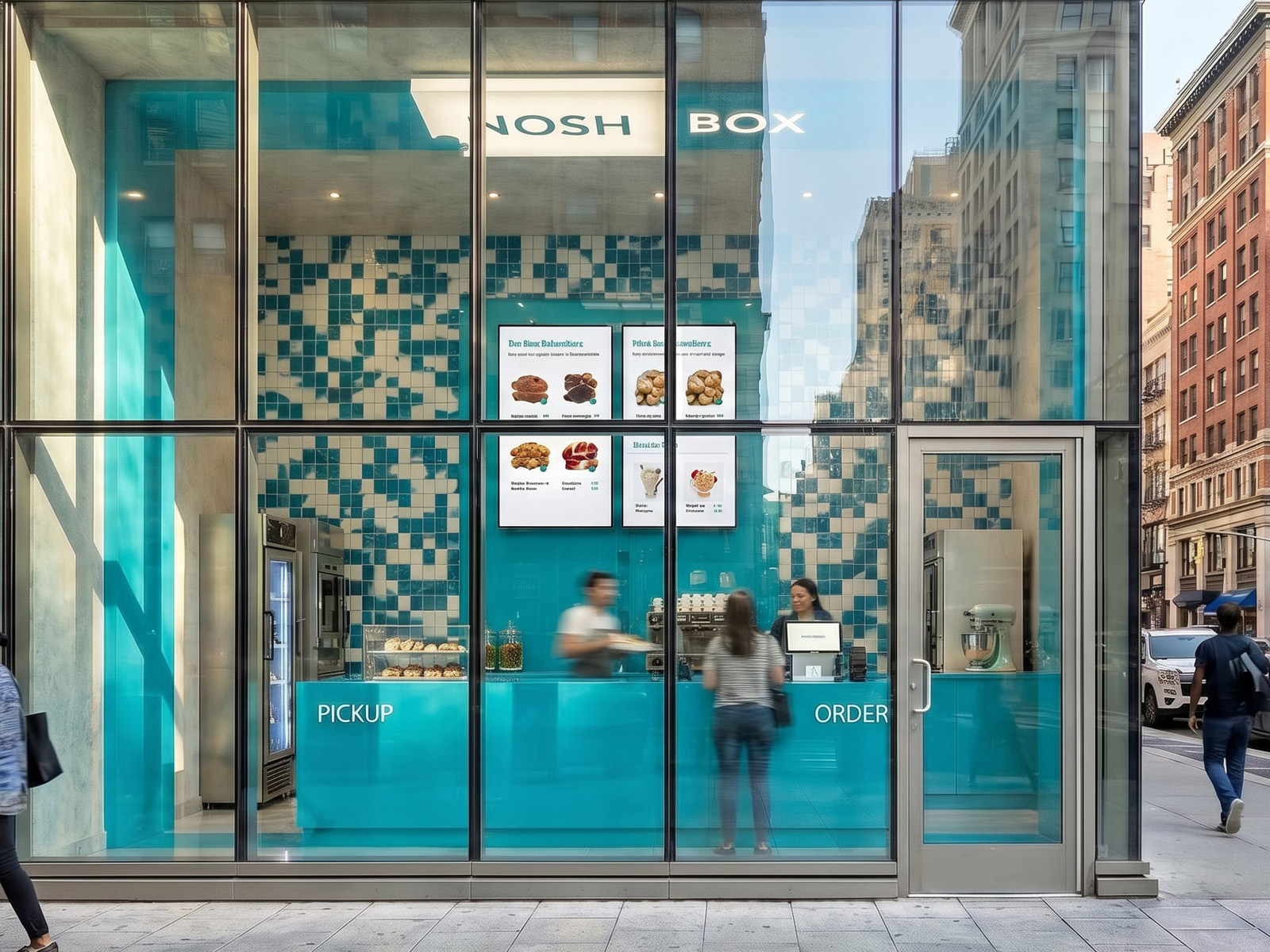
There is a moment that happens in almost every well-designed food space today — a customer walks in, stops, and reaches for their phone before they reach for the menu.
That moment is not an accident. It is a design outcome. And at NoshBox, it was the brief.
The NoshBox concept was built around a takeaway-only model: no seats, no tables, a service that is measured in minutes. In that context, the traditional measures of hospitality design — comfort, dwell time, atmosphere — lose some of their weight. What replaces them is something newer and in many ways harder to design for: the space's ability to exist and communicate beyond its own four walls. To live on a screen. To travel.
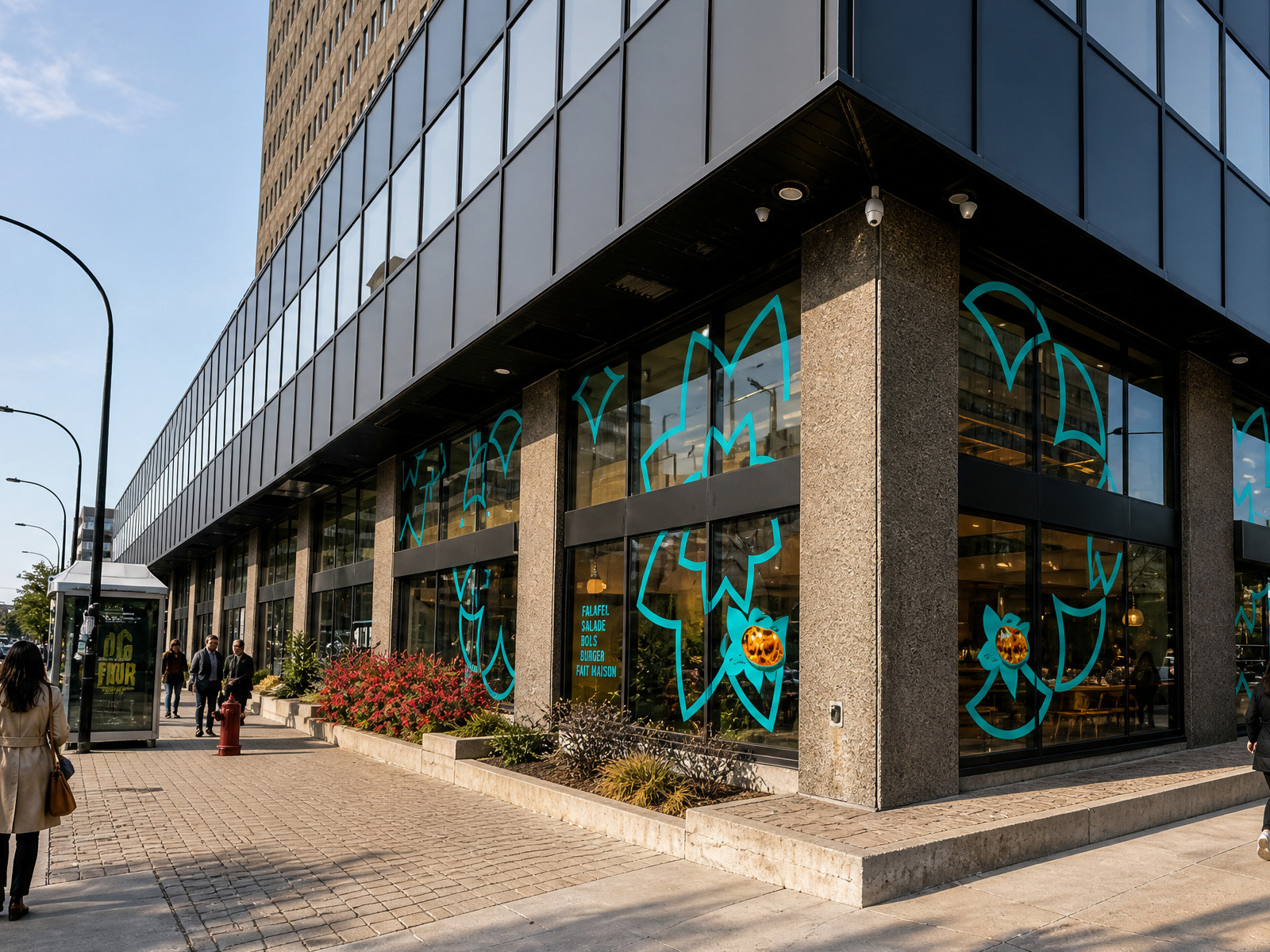
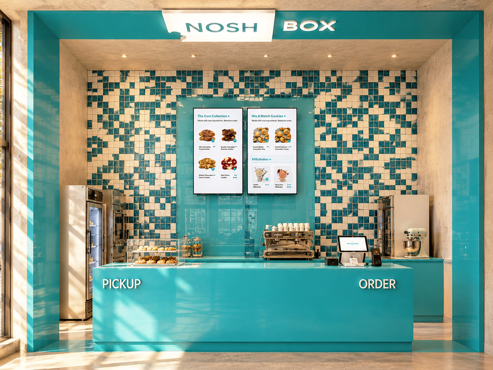
The checkered teal and white tile wall behind the NoshBox counter is the most photographed surface in the space — by design.
It does several things at once. At close range, it is clearly handmade: each tile carries a slightly different tonal variation from the glaze firing, giving the pattern warmth and texture that a printed graphic could never replicate. From across the counter, it reads as a bold brand graphic — the teal-and-white pixel pattern that connects the wall directly to the brand's color system and packaging. From the street through the glass facade, it is a billboard: an image so immediately associated with the brand that anyone who has seen NoshBox once will recognize it again instantly.
A wall that works at three different scales — intimate, interior, and exterior — is a wall that was designed for a camera as much as for a room.
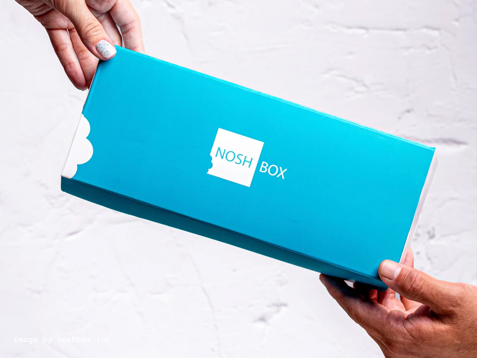
Every NoshBox order leaves in the same teal box — the same brand color, the same clean typography, the same visual identity that runs through every surface of the space. That box is the final touchpoint in the customer journey, and it is also the first thing that travels.
It gets photographed on countertops, on dining tables, in the back of taxis. It appears in unboxing videos. It gets tagged. It is, in the most literal sense, a piece of the interior design that the customer takes with them.
Designing the NoshBox space and designing the NoshBox packaging were never two separate decisions. They were the same decision — made in the same palette, with the same intention, for the same camera.
That is what it means to design for the phone. Not to add a selfie wall or a neon sign. To design a space where the brand identity is so consistent, so spatially embedded, and so visually specific that every image taken inside it — or of anything that came from inside it — is already doing marketing work.
If your food or retail concept needs to live on screens as well as it lives in person, the design decisions that make that happen are not an afterthought — they are the foundation.
At Atelier MIM, we design spaces where brand and architecture are the same conversation, from the first sketch to the last tile.